
FIT3084: Page
Design
In the previous lecture:
In this lecture:
The moment you've all been waiting for... time to design a web page!
|
"We seek clarity, order, and trustworthiness in
information sources,
|
Visual Hierarchy
Create a strong and consistent visual hierarchy which leads the viewer's eye around a page. Your tools: layout, typography, illustration.
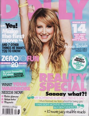
Consider the covers of these magazines. What does your eye focus on first? Second? Third? Fourth?
|
|
|
Usually the eye catches elements in this order:
This is a visual hierarchy! |
 |
An example...
 |
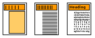
Which page design is preferable? Why? Where does the eye focus? How is the visual hierarchy established? |
 |
||
Part of the result of a well-known study of eye tracking over an image entitled An Unexpected Visitor, by I.E. Repin. |
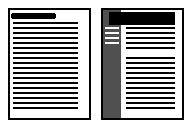
Tracking the eye over a newspaper sheet. |
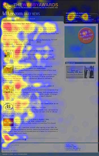
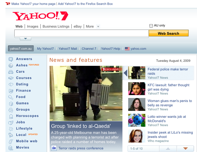
Tracking the eye over a web page. |
Importance of Contrast
Contrast is used to assist in achieving these broad goals for layout and composition...
Balance
(Left and right, top and bottom, front and back)
Gridding
(Elements should line up)
Proportion
(Certain ratios are more pleasing than others)
|
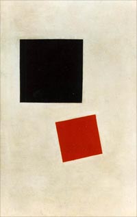
Square |
1:1 |
 |
|
Kasimir Malevich (1878 - 1935) Black Square and Red Square, 1915 Oil on Canvas, 28x17.5", Museum of Modern Art, NY. |
|
Square
root
|
1:1.414
|
 |
||
|
Golden
Rectangle
|
1:1.618
|
 |
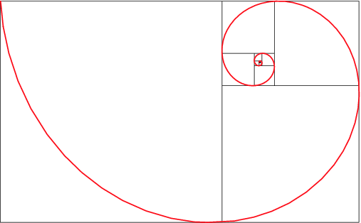 |
A golden rectangle can always be subdivided into a square and another golden rectangle. |
|
Double
Square
|
1:2
|
 |
Aesthetic proportions have been studied for thousands of years from ancient Egypt through the Greek and Roman empires, during the Renaissance... right up until the present day.
 |
 |
 |
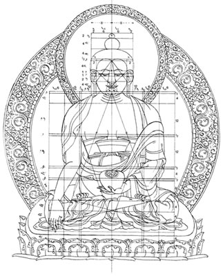
The Buddha. In many cultures, some proportions are considered sacred or divine and incoporated into religious music, art and architecture. |
Orders of classical columns. Columns are sub-divided repeatedly into thirds. |
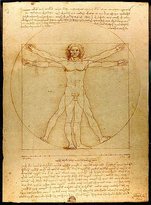
Proportions of the human figure. Da Vinci's study of proportions of a man based on the work of the Roman architect Vitruvius. |
Consistency
Choose a layout style for your pages and apply it across your site
Choose a graphical style for your pages and apply it across your site
Page Dimensions
Computer screens are small and of low-resolution compared to print media.
Computer screens are cluttered with browser borders, menu bars, control strips, scroll bars.
The smallest common monitor size is 640x480 pixels.
Be aware of the monitor sizes used by your target audience.
People may want to print your web pages onto A4 paper - especially if they contain lots of text!
|
Graphic Safe dimensions for printing |
width=535 pixels |
|
Graphic Safe dimensions for small screen-only use (640x480 pixels) |
width=595 pixels |
Page Length
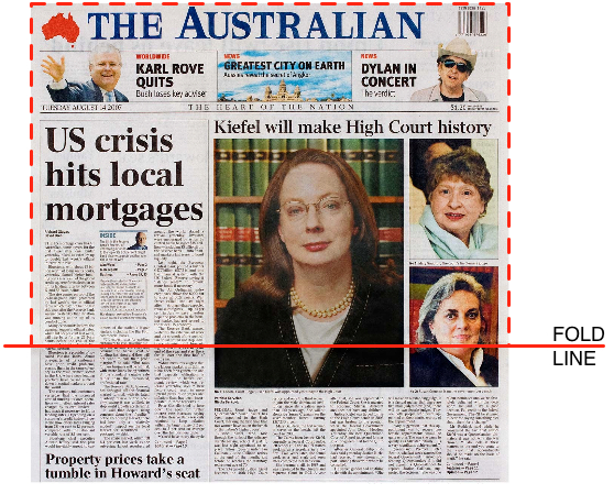 |
Pay great attention to page content that appears "above the fold". What does this mean? Why is this necessary?
But a user can scroll can't they?
Avoid scrolling if possible. |
The proper page length to employ will depend on:
Minimize the damage of long pages by:
|
Shorter web pages are good for:
|
Longer web pages are good for:
|
Web pages must be free-standing
Pages may be accessed at random so each page needs to make sense on its own.
Every web page needs to answer the following basic questions:
 |
What:
When:
Where: clickable links to various places including home
|
 |
Who: |
Page Headers & Footers
Page headers and footers may help the user by:
...yes, page headers and footers are an excellent means of providing consistency!
(Make these clear, but not so large that they dominate or waste precious screen real-estate)
XHTML assistance
Plain XHTML is not really suitable for complex page layout tasks.
Making Decisions about Page Architecture
....only now is it time to sit down and enter XHTML!
©Copyright Alan Dorin 2009